Choosing the right curtain color can dramatically change the look and feel of your space. To create a harmonious interior design, consider selecting curtain colors that either match or complement your wall paint. This simple choice can enhance your room’s aesthetics and make it feel more cohesive.
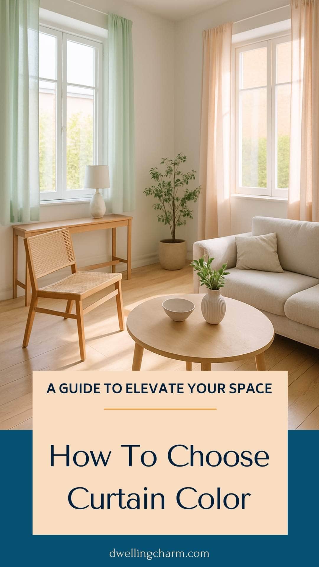
When selecting curtains, think about your existing color palette, which includes your walls, furniture, and decor. Neutral tones can create a warm and inviting atmosphere, while bolder colors may add a splash of personality to your room. Remember that darker curtains can sometimes be visually disruptive, so finding that perfect balance is key.
Don’t be afraid to experiment! By evaluating different shades and textures, you can find the ideal curtain color that fits your style and enhances your home. With the right choices, your curtains can be both a practical and beautiful addition to any room.
Understanding the Basics of Curtain Colors
Choosing the right curtain color is important for setting the mood in a room. It can complement your existing color palette and tie together your décor. Let’s explore why color matters and how different types of curtains can affect your space.
Significance of Color Choice in Interior Design
The color of your curtains can influence the entire feel of a room. Lighter colors tend to make a space feel larger and airier, while darker colors can create a cozy, intimate atmosphere.
When picking a color, think about your walls and furniture. A good rule is to choose curtains that are one shade lighter or darker than your wall color. This creates a cohesive look.
Tips for Choosing Color:
- Use a color wheel to find complementary colors.
- Consider neutral tones for versatility.
- Don’t forget about patterns, which can add interest.
Different Types of Curtains and Their Impact
The type of curtains you choose also plays a role in aesthetics. For example, sheer curtains allow light in, making the space feel bright and open. These are great for living rooms or sunny areas.
On the other hand, heavy drapes provide privacy and insulation. They work well in bedrooms or media rooms where light control is essential.
Common Curtain Types:
- Sheer: Light and airy, good for soft lighting.
- Blackout: Blocks light entirely for privacy.
- Linen: A natural look that pairs well with many styles.
By combining the right colors with the appropriate curtain types, you can enhance your space beautifully.
The Role of Natural Light in Choosing Curtains
Natural light greatly affects how colors appear in your space. Understanding how light interacts with curtain colors can help you make the best choice for your room. Here, we explore how light control influences color and suggest suitable colors for different lighting situations.
Impact of Light Control on Curtain Color
Light control is crucial in selecting curtain colors. Thicker fabrics block more light, creating a cozy environment. These darker shades can add warmth and richness to the room.
In contrast, sheer curtains let in more natural light. This option brightens your space and can make colors appear more vibrant. For example, soft pastels or light neutrals work well with sheer fabrics, enhancing the natural glow.
Choosing the right fabric is essential. If you have ample natural light, you might prefer lighter shades to avoid the space feeling too enclosed. Conversely, if your room gets very little sunlight, darker colors can add depth and warmth, making it feel more inviting.
Best Curtain Colors for Sunny and Dim Rooms
When dealing with bright, sunny rooms, opt for lighter colors. Light creams, whites, and pastels can reflect sunlight, keeping the room airy and fresh. These colors also minimize fading from sun exposure while complementing vibrant decor.
In dimly lit spaces, deeper shades like navy or burgundy can add richness without overwhelming the room. Darker colors help create an intimate atmosphere, especially when using thicker fabrics for light control.
Consider the style of your room, too. Bold colors can stand out in bright spaces, while soft hues bring calmness to more subdued settings. Choosing the right color based on natural light can enhance your home’s overall feel!
Selecting the Right Curtain Color for Your Room
Choosing the right curtain color can transform your space. It can tie together your decor and set the mood of the room. Consider the following ways to select curtains that work perfectly with your room’s style and wall color.
Matching Curtains With Wall Color
When matching curtains with your wall color, aim for a cohesive look. If your walls are painted white, you might consider soft, neutral tones for your curtains. Colors like light beige or soft gray can create a soothing effect.
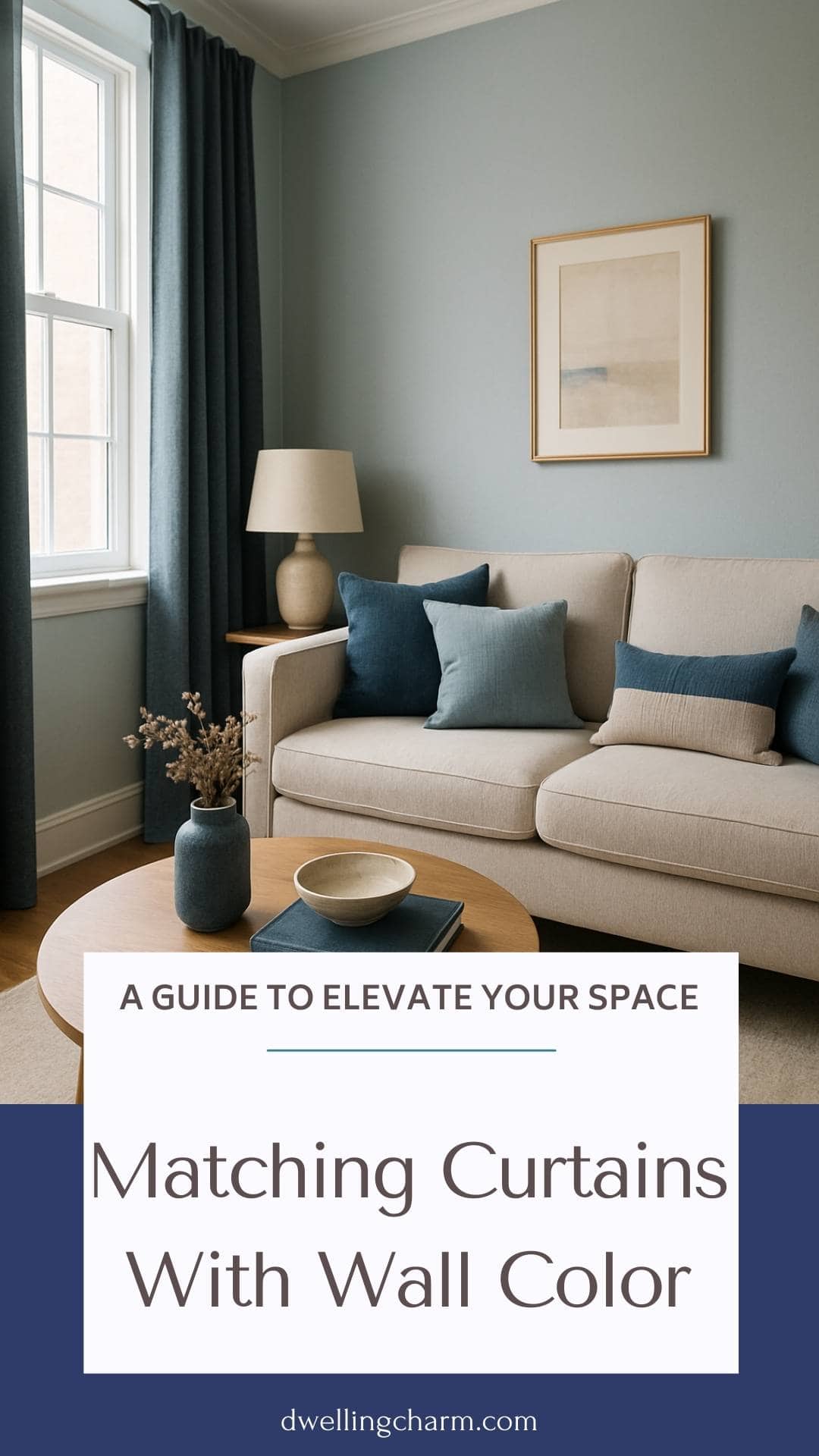
If your walls have more color, use curtains in a similar shade but a few tones darker. This creates a harmonious look while adding depth. For example, if you have light blue walls, navy curtains can enhance the space beautifully. You can also use fabric swatches to see how different options look in your light.
Creating Visual Interest With Contrast
For a more striking effect, think about contrast. Dark curtains against light walls can make a bold statement. For example, if your walls are white, rich colors like deep green or burgundy can add drama.
Using patterned curtains can also create interest. Choose patterns that include colors from your decor to tie everything together. If your walls are a light color, consider adding curtains with a vibrant print. This can make your windows the focal point and bring energy to the room.
Color Curtains for a Vibrant Ambiance
If you want to create a vibrant atmosphere, opt for colorful curtains. Bright shades like sunny yellow or lively turquoise can breathe life into your space. These colors can be especially effective in a kitchen or playroom.
Don’t shy away from mixing patterns and colors. You can pair solid curtains with patterned throws or cushions that match your curtain color. This adds a playful touch to your room while maintaining a balanced look. Just ensure that the colors you choose complement each other instead of clashing.
Avoiding Common Curtain Color Mistakes
Choosing the right curtain color is essential for both style and practicality. Two crucial aspects to consider are how color affects your privacy and the advantages of opting for neutral shades.
Choosing the Right Color for Privacy
When selecting curtain colors, think about how they affect privacy. For example, red curtains might look bold and striking but can sometimes draw too much attention from outside your home. This can leave you feeling exposed, especially at night.
Consider darker shades like navy blue or deep green, which provide more privacy without sacrificing style. If you choose lighter colors, make sure the fabric is thick enough to block views from outside. The right color choice can enhance your home’s comfort and security.
Why Neutral Colors Are a Safe Choice
Neutral colors like beige, gray, or white are often the safest options. They blend well with various wall colors and furniture styles. This versatility means you won’t have to change curtains if you decide to redecorate.
Using neutral curtains also creates a calming atmosphere. They allow natural light in while keeping a warm and inviting feel. Additionally, if you ever feel unsure about what fits your room, neutral colors are a reliable fallback. This helps you avoid common curtain color mistakes and keeps your space looking cohesive and stylish.
Exploring Curtain Color Options
Choosing the right curtain color can significantly affect the mood and style of your room. Below are several color options that can enhance your space while reflecting your personality.
The Elegance of White Curtains
White curtains are a classic choice that brings a fresh and airy feel to any room. They can easily match with various wall colors and decor styles.
Consider using white curtains if you want to create a bright and inviting atmosphere. They help reflect natural light and can make your space feel larger.
You can choose from sheer whites for a soft look to thicker fabrics for more privacy. Pair them with colorful accessories or furniture for a stylish contrast.
Boldness of Black Versus Calming Blue
Black curtains add a bold touch to your decor. They can create a dramatic effect, making a room feel chic and sophisticated.
Use black curtains in spaces where you want to assert confidence and elegance. They work well with both light and dark surroundings.
In contrast, blue curtains offer a calming effect. Lighter shades, like sky blue, bring tranquility, while navy adds depth and richness. Blue curtains can create a serene ambiance, perfect for bedrooms or study areas.
Green Curtains for a Natural Feel
Green curtains evoke the beauty of nature, making them an excellent choice for those who love outdoor vibes. They come in various shades—from soft sage to deep forest green.
Use green curtains to add warmth and liveliness to your space. These colors can also enhance plants and natural wood elements in your room.
For a refreshing look, pair green curtains with neutral furniture. This combination can create a balanced and peaceful setting.
Cheerful Peach and Playful Pink
Peach curtains can instantly brighten up a room, adding a cheerful and inviting look. They are warm and can create a cozy atmosphere.
Peach works well with other pastel shades and soft neutrals. You can pair them with white or light gray for a light and airy feel.
Pink curtains, on the other hand, can add a fun and playful touch. Shades like blush or coral can bring energy to your space. Pink can look great in kids’ rooms or areas where you want a touch of whimsy.
Statement Pieces: Turquoise and Magenta
Turquoise curtains can serve as a statement piece in your room. They are vibrant and eye-catching, perfect for adding a pop of color.
This shade pairs well with whites and neutrals, creating a lively contrast. It works especially well in spaces where you want to encourage creativity and energy.
Magenta curtains bring boldness and flair. They can transform a simple room into a vibrant space full of personality. Consider using magenta in areas where you entertain or relax to create an energetic atmosphere.
Curtain Color Ideas for Unique Interior Themes
Choosing curtain colors can enhance your home’s style. Specific themes call for particular colors and fabrics to create a unified look and feel. Here are some helpful ideas to guide your choices.
Thematic Window Treatments For Cohesive Looks
To create a cohesive theme, your curtains should reflect the style of your room. For example, if you have a rustic theme, consider earthy tones like taupe or forest green. Natural fabrics such as burlap or linen work well for a cozy feel.
In a modern setting, opt for colors that are either a step lighter or darker than your walls. Bold hues like navy or deep burgundy can add depth. For a beachy vibe, go for soft blues or whites in lightweight fabrics like cotton.
Aligning your curtains with your theme enhances the overall look. Make sure to think about texture as well as color to keep things interesting.
Combining Colors and Fabrics for Custom Styles
Mixing colors and fabrics can give your space a personal touch. Try using complementary colors on opposite sides of the color wheel. For instance, pair soft gray curtains with a mustard or warmer yellow for a striking contrast.
Layering fabrics can also add richness. Start with a base curtain in a neutral shade, then add a lighter sheer curtain. This technique allows light to filter through while still providing a polished look.
You can also try a patterned curtain on a solid backdrop for added visual interest. Floral or geometric patterns can make a statement in a simple room. Mixing textures, like combining smooth silk with textured linen, can also create a unique style.