Smart Color Matching Tool
Upload an image of your room to get the best color palette!
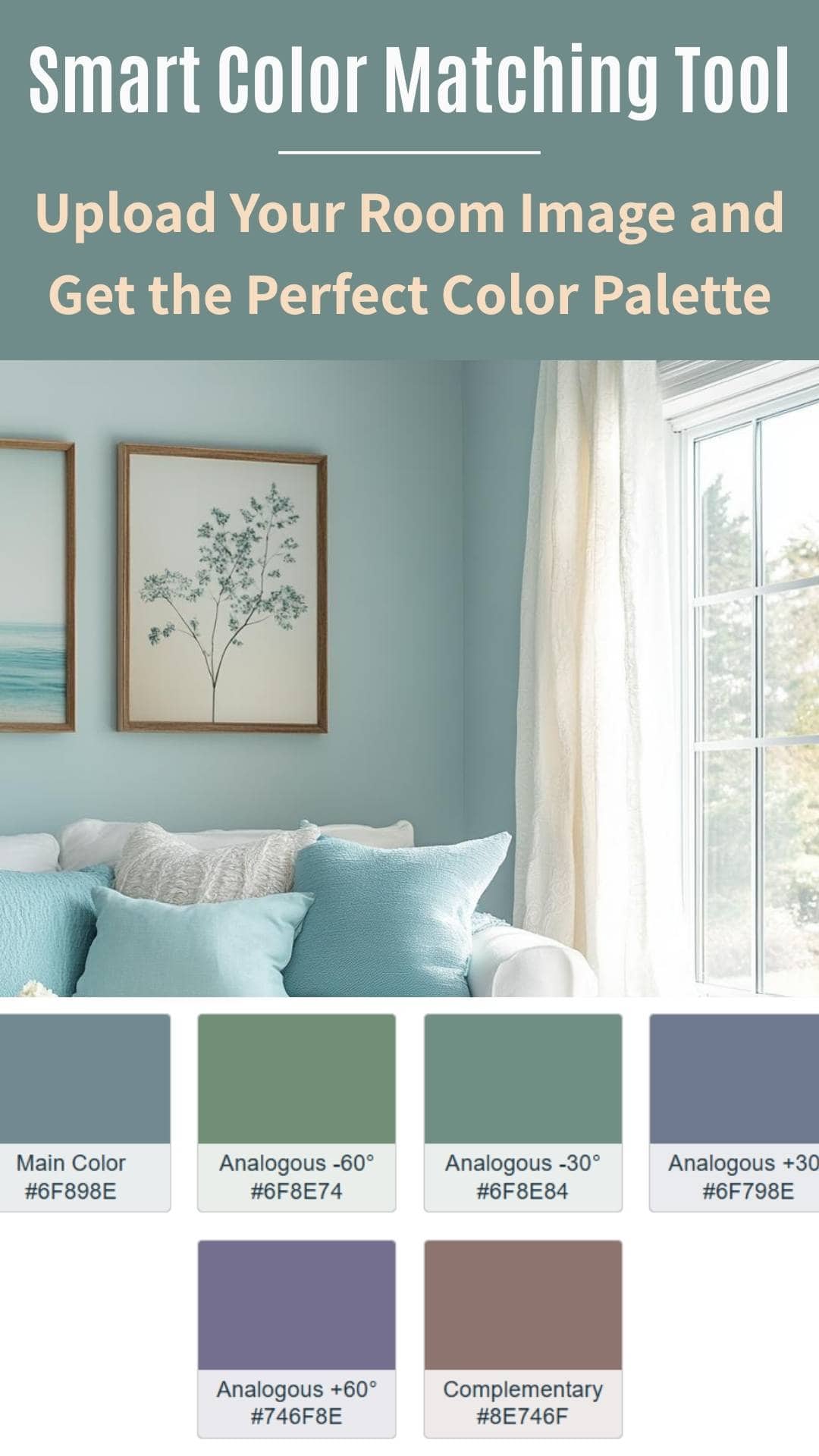
Based on your uploaded room image, we have generated a color palette that includes the primary color, complementary shades, and harmonious tones for your space.
Welcome to the Smart Color Matching Tool! Whether you’re a professional interior designer or a DIY enthusiast looking to refresh your space, this tool is here to simplify your color selection process.
By simply uploading an image of your room, you can instantly generate a personalized color palette that is perfectly tailored to your space. The tool extracts the dominant colors from your image, offering you a custom palette with complementary and analogous shades that will make your space feel harmonious and cohesive.
No more guessing which colors will work well together. With the Smart Color Matching Tool, you’ll get a clear, professional color palette based on real room data to help you make confident, informed decisions.
So, upload your room image now, and let’s create the perfect color scheme for your space!
How the Tool Works
The Smart Color Matching Tool works by analyzing the colors in the image you upload, extracting the dominant colors, and using color theory to generate a harmonious palette. Here’s a step-by-step overview of the process:
- Upload Your Image:
- Simply click on the upload button and select an image from your device. It could be a photo of your living room, bedroom, kitchen, or any other space you’d like to update with a new color scheme.
- Automatic Color Extraction:
- Once your image is uploaded, the tool uses an algorithm to detect the dominant colors in the room. This is done with the help of a powerful tool known as Color Thief, which extracts the most prominent colors.
- Generate Color Palette:
- After the extraction, the tool uses Chroma.js to generate a complete palette based on the dominant color. It will show you the base color, analogous colors (shades that complement the base color), and a complementary color (the opposite color on the color wheel) for a balanced, cohesive look.
- Visual Display of Colors:
- The colors are displayed as color swatches, each labeled with its hex code for easy reference. The tool also includes helpful tooltips to provide more context about each color, so you can understand the hue and how it fits with the overall aesthetic of the room.
Why Use the Smart Color Matching Tool?
Choosing the right color palette for your home can be an overwhelming task, especially when you want it to reflect your personality and fit seamlessly into your existing decor. The Smart Color Matching Tool helps you:
- Get Accurate Color Matches: Instead of guessing or relying on abstract color wheels, the tool provides color suggestions based on real images and proven color theory.
- Save Time: Skip the trial and error phase of paint swatches and experiment with an array of colors instantly. Get suggestions in seconds!
- Create Harmonious Spaces: Whether you’re designing a cozy bedroom or a modern living room, the tool ensures the colors you select work together, creating a balanced and visually pleasing environment.
- Personalize Your Room: The tool adapts to your specific room’s image, providing customized color suggestions that match the natural vibe of your space. You’ll receive a palette that truly complements your home.
How to Use the Smart Color Matching Tool
Using the Smart Color Matching Tool is quick and simple. Here’s a breakdown of how you can get started and make the most out of the tool:
- Upload Your Room Image:
- The first step is to upload an image of your room. Whether it’s your living room, bedroom, kitchen, or any other space, make sure the photo captures the colors and elements you want to focus on. The tool will analyze this image to generate your custom color palette.
- Let the Tool Analyze the Colors:
- After uploading the image, the tool will automatically extract the dominant color(s) from your photo. This step uses an advanced algorithm to identify key colors, which will serve as the foundation for your color palette.
- View Your Color Palette:
- Once the colors are extracted, the tool generates a palette of 5 color options:
- Base Color: This is the dominant color found in the image, serving as the main color for your room.
- Analogous Colors: These colors are in harmony with your base color and create a cohesive, balanced look. You’ll see four analogous shades, each shifted by different degrees (e.g., +30°, -30°, +60°, -60°).
- Complementary Color: This is the color that is directly opposite to your base color on the color wheel, creating a high contrast and vibrant look.
- Once the colors are extracted, the tool generates a palette of 5 color options:
- Explore the Swatches:
- You’ll be able to see all five colors in the form of swatches. Each swatch is color-coded and labeled with its hex code, so you can easily match it to paint brands or home decor materials. The tooltips on each swatch provide extra details, helping you understand the characteristics of each color (e.g., hue, tone).
- Save or Share Your Palette:
- If you like a palette, you can save it for future reference or share it with your family, friends, or even your interior designer. You can also use the hex codes to find matching paints at your local hardware store.
This step-by-step approach gives you full control over the process, while ensuring that the colors you select are cohesive and visually appealing.
Tips for Using the Smart Color Matching Tool Effectively
To get the most out of the Smart Color Matching Tool, here are some useful tips:
- Choose Clear, High-Quality Images:
- The quality of the image you upload can impact the accuracy of the color extraction. Make sure the photo is well-lit and clear, so the tool can better identify the dominant colors in your room.
- Use the Tool for Room Themes:
- Try uploading images from different rooms (e.g., living rooms, kitchens, bedrooms) to see how the tool adapts to each setting. It’s perfect for experimenting with multiple design styles!
- Adjust and Fine-Tune Your Palette:
- While the tool provides a solid foundation, you can always adjust the colors based on your preferences. If the base color isn’t exactly what you’re envisioning, use the analogous or complementary colors as inspiration to create a palette that fits your style.
- Mix and Match Colors:
- You don’t have to stick to just one color from the palette. Feel free to mix and match the analogous colors with your base color for accent walls, furniture, or accessories. The tool helps you understand how the colors work together.
- Consider Mood and Lighting:
- Keep in mind that colors may look different in various lighting conditions. If possible, test colors in the actual room to ensure they create the desired mood and ambiance.
Final Thoughts
The Smart Color Matching Tool is a must-have for anyone looking to refresh their home with beautiful, well-coordinated colors. Whether you’re a first-time home decorator or an experienced DIYer, this tool will help you choose the perfect palette with ease. By using the tool’s smart color extraction and combination features, you can save time, reduce stress, and feel confident in your color decisions.
Now you can confidently move forward with your painting or decorating projects, knowing that you have a customized, harmonious color palette designed to bring your space to life.