Cream walls offer a timeless and versatile backdrop, making them a favorite choice for home interiors. Their warm and neutral tone creates a welcoming and cozy atmosphere while allowing for endless decorating possibilities. However, choosing the right curtain color is essential to enhance the beauty of cream walls and set the overall mood of the space.

The perfect curtain color should complement the warmth of cream walls while adding depth, contrast, or softness depending on the desired look. Lighter hues can create an airy and seamless aesthetic, while darker shades add drama and sophistication. Earthy and muted tones introduce warmth and a natural feel, whereas bold colors make a statement.
In this article, we’ll explore 11 of the best curtain colors to pair with cream walls, from soft neutrals to bold contrasts. Whether you’re aiming for a modern, elegant, or cozy ambiance, these curtain colors will help you achieve a harmonious and stylish space. Let’s dive in!
1. Navy Blue
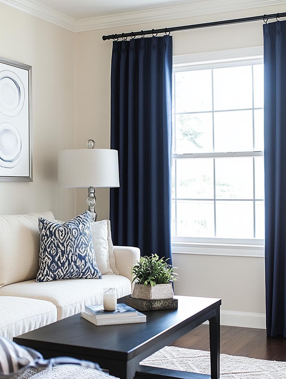
Navy blue curtains can add a bold and striking contrast to your cream walls. The deep blue shade brings a touch of elegance and can make a room feel both cozy and sophisticated.
Pairing navy blue in your home can suit many styles, from classic to modern. It brings depth and can anchor the room, setting a calming yet strong tone.
The rich color might also highlight other accents in the room, like furniture or art pieces, making them pop against the cream walls. Navy blue curtains are a great choice if you want to add character without overwhelming the space.
2. Charcoal Gray

Charcoal gray curtains can add a touch of modern elegance to your cream walls. This color gives the room a sleek and contemporary vibe while still being subtle.
The dark, rich tone of charcoal gray creates a striking contrast with cream walls. This makes your windows stand out and adds depth to your space.
You might find that charcoal gray works great for both formal and casual settings. It’s a versatile color that can complement a variety of decor styles.
3. Mustard Yellow
If you want a pop of color that still feels warm and inviting, mustard yellow curtains can be a great choice for cream walls. They add a cheerful vibe to the space without being too bold.
Mustard yellow creates a cozy atmosphere and pairs well with cream. The combination brings a timeless, gentle contrast to any room.
You might also find that mustard yellow works well with wood accents and greenery. This can help enhance an earthy and warm vibe in your room.
4. Sage Green
Sage green is a calm and peaceful color that looks beautiful with cream walls. When you choose sage green curtains, they add a gentle pop of color without being overwhelming. The combination creates a soothing atmosphere in your room.
Sage green brings a touch of nature indoors, making your space feel fresh and inviting. It pairs well with natural materials like wood and plants.
You can create a cozy, balanced look by adding some sage green pillows or throws to match your curtains. This choice works well in both modern and traditional spaces, giving your home a relaxed and harmonious vibe.
5. Blush Pink
Blush pink curtains bring a soft and romantic feel to any room with cream walls. This subtle shade of pink adds warmth without being too bold. It’s a gentle way to introduce a touch of color.
With cream walls, blush pink combines well because it keeps the space light and airy. The blend of pink and cream feels soothing and inviting. It’s a lovely choice for bedrooms or living areas where you want a calm atmosphere.
Choose light fabrics like sheer or linen for your blush pink curtains. These materials ensure that the room remains bright and open while adding a hint of elegance. Such a combination can make your home feel cozy and stylish.
6. Terracotta
Terracotta curtains bring a warm and earthy feel to your room with cream walls. The reddish-brown tones create a cozy atmosphere, making your space feel inviting. This color works well if you love a rustic or natural decor style.
You’ll notice that terracotta adds a touch of warmth without being too bold. It’s a great choice for living rooms and bedrooms, where you want a comfortable vibe. Pairing these curtains with plants or wood accents can enhance the natural look.
Consider using terracotta curtains if you’re aiming for a Mediterranean or bohemian style at home. The deep, rich color complements other natural materials like stone or clay pots, tying the room together seamlessly.
7. Burnt Orange
Burnt orange curtains can add a warm and cozy feel to your cream walls. This shade is rich and vibrant, bringing a touch of energy to the room without being too flashy.
Pairing these curtains with cream walls offers a balanced look. The orange color provides a pleasing contrast that highlights the warmth of cream. It’s a combination that feels inviting and stylish.
Using burnt orange also works well if you have other earthy tones in your decor. It blends nicely with wooden furniture and natural textures, creating a cohesive atmosphere. If you love a warm, inviting space, burnt orange is a great choice for your curtains.
8. Deep Plum
Deep plum curtains can bring a touch of elegance and drama to your room with cream walls. This rich color adds depth and warmth, creating a cozy atmosphere. It pairs beautifully with cream, offering a striking contrast that enhances the overall look of your space.
You might find deep plum works especially well in living rooms or bedrooms. It can create a sophisticated and stylish vibe. Plus, it can complement various styles, from modern to vintage.
Accessorize your space with metallic accents or neutral tones to highlight your plum curtains even more. This color choice is perfect if you want to make a statement without being overly bold.
9. Teal
Teal is a refreshing and unique choice for curtains in a room with cream walls. It adds a touch of color without being too overwhelming. This shade brings a sense of calmness and creativity to your space.
The balance between the warm cream and the cool teal creates an interesting and inviting atmosphere. This color duo can brighten up a room and make it feel cozy yet lively.
When you choose teal curtains, consider matching them with teal accents or decor pieces in the room. This can tie everything together and create a cohesive look that feels well thought out.
10. Soft Lavender
Soft lavender is a delightful option for curtains with cream walls. The gentle purple shade can add a hint of color without overwhelming the room. It’s perfect for creating a peaceful atmosphere.
When paired with cream, soft lavender brings a touch of elegance. The combination works well in living rooms or bedrooms where a calming space is desired.
You can also match soft lavender with other light pastel colors. This can help to make the room feel fresh and airy. Adding a few lavender accessories like pillows or throws can tie the room together nicely too.
Consider the fabric of your curtains when selecting soft lavender. Lighter fabrics can enhance the gentle feel, while heavier fabrics offer more privacy and light control. This versatile color choice can transform your cream-walled space into a soothing retreat.
11. Chocolate Brown
Chocolate brown is a warm, inviting curtain color that goes wonderfully with cream walls. The deep shade adds coziness and comfort to your room, making it perfect for relaxing areas like living rooms or family spaces.
You’ll find that chocolate brown curtains can enhance the natural warmth of cream walls. This combination creates a welcoming atmosphere that’s ideal for reading or spending time with family. If you love a traditional look, chocolate brown offers a classic feel. Using this color creates a space that feels homely and chic.
Understanding Color Harmony
Color harmony is about blending colors in a way that is pleasing to the eye. It involves selecting shades that work together to create a balanced and stylish look for your space. When you have cream walls, certain approaches can help make your room feel just right.
The Basics of Color Matching
Matching colors is more than just picking ones that are nice on their own. It’s about how they work together. You have to think about color wheels and how different shades either complement or contrast each other.
Colors near each other on the color wheel create a calm and harmonious effect. For instance, a monochromatic scheme with cream, off-white, and brown can look seamless and soothing. Complementary colors opposites on the wheel offer bold contrasts which can highlight features in a room.
Overall, effective color matching requires a balance between colors that play well together and those that make each other stand out. Adding shades like blue or green can energize the space, whereas using neutral tones keeps it soft and subtle.
How Cream Walls Influence Room Ambiance
Cream walls lend a soft, inviting feel to any room. Their neutral tone makes them incredibly versatile for pairing with various colors. This creates endless possibilities for setting the mood and atmosphere in your home.
When you choose colors to pair with cream walls, consider the room’s size and purpose. Light colors can make a space feel larger and more open, while darker shades may add warmth and coziness. Earth tones like green or brown complement cream, enhancing natural vibes and tranquility.
Whether you prefer a serene setting or a lively atmosphere, cream walls provide a perfect backdrop to play with different colors and textures.
Curtain Materials and Their Impact on Color
Different curtain materials can dramatically affect how colors look in a room. Fabric choice influences color vibrancy, light flow, and the room’s ambiance.
Choosing Fabrics for Visual Appeal
When picking curtain materials, consider how each fabric displays color. Cotton curtains are popular for their versatility, showcasing colors with richness and balance. They work well for both vibrant and subtle tones. Linen tends to give colors a muted, sophisticated look, perfect for a soft touch in a bright space.
On the other hand, velvet is a heavyweight fabric that enriches darker colors like deep blue or burgundy, adding a luxurious feel to the room. Sheer fabrics, like voile, can soften bold colors, creating a light and airy look while still adding a splash of color to your cream walls.
Light Filtering and Color Perception
The way a curtain material filters light also affects how you perceive its color. Sheer curtains allow plenty of natural light, which can make colors appear softer and more faded, perfect for a relaxed atmosphere. This can create a lovely interplay of light and shadows across your room.
Blackout curtains, though, provide excellent privacy and block out light almost entirely. This means colors will appear richer and more intense since they aren’t affected by outside lighting. If you want to enhance color saturation for a dramatic effect, blackout fabrics are a great choice.
Consider how light will interact with your curtain material to achieve the ideal look and feel for your space.