Discover how soft pastel colors can transform the look of your home’s exterior and bring a sense of charm to your neighborhood. These gentle hues create a welcoming and calming ambiance, setting your house apart from the usual neutral tones.
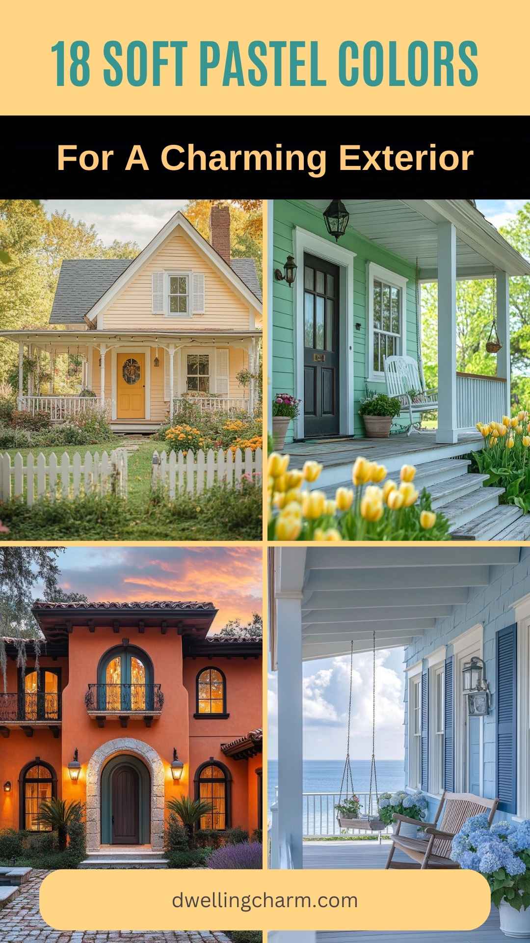
Explore how using pastel colors on your home’s exterior can enhance its curb appeal and make it stand out beautifully. Whether you prefer shades of pink, blue, yellow, or green, pastels offer an inviting and unique appearance. They might just be the perfect choice for your next home makeover.
1. Blush Pink Delight
Blush pink is a charming choice for your home’s exterior. It adds a soft, welcoming touch that feels both fresh and timeless.
Pairing blush pink with crisp white trim gives your house a clean look that stands out without being too bold. This combination creates an elegant aesthetic that invites warmth and friendliness.
Consider adding a few elements like white shutters or a door to enhance this delightful theme. These accents can tie everything together beautifully, creating a cozy curb appeal.
Your home will feel unique in a neighborhood full of neutral tones with this gentle color. Whether in bright sunshine or under a cloudy sky, a blush pink exterior maintains its cheerfulness, bringing smiles to anyone passing by.
2. Mint Whisper

Mint Whisper is a delightful choice for your home exterior. This pastel shade brings a fresh and calming vibe.
If you pair mint with white trim, it creates a clean and crisp look. Natural wood accents can add warmth, making your home feel inviting.
This color is perfect for cottages and beach houses. It gives off a relaxed and airy feel. You’ll love how it stands out among more traditional homes. Consider Mint Whisper for a touch of charm and serenity.
3. Soft Lilac Dreams
Soft lilac is a dreamy and subtle choice for your house’s exterior. This gentle color brings a sense of whimsy and charm to any home. It can make your house stand out without being too loud or overwhelming.
Using lilac on your house can create a soothing vibe. It works well in gardens and landscaped areas, blending beautifully with lush greenery.
Incorporate white trim or accents to make the lilac pop. This combination adds a classic touch that is both elegant and delightful. Consider this soft hue if you’re looking to refresh your home’s look with something unique yet gentle.
4. Champagne Glow
Imagine transforming your home’s exterior with a Champagne Glow. This color brings a sense of elegance and warmth, like the soft golden sparkles of a fine drink.
Champagne Glow pairs wonderfully with other pastel shades. You might consider trim in shades like mint green or lavender for a fresh look. It brings a breezy, inviting vibe that makes your house feel more welcoming.
For an extra touch, use Champagne Glow on details like shutters or doors. It adds a sophisticated charm without being too bold. Your home will stand out, put together yet charming in its subtlety.
5. Powder Blue Breeze
Picture a house that feels like a refreshing breath on a warm day. That’s the essence of powder blue. This soft, pastel shade wraps your home in a gentle, calming hue. The welcoming vibe it gives is perfect for creating a peaceful and inviting exterior.
You might love how powder blue blends with nature. It’s a color that seems to dance with the sky and harmonizes with gardens and greenery. This makes it an ideal choice if you want your home to feel connected to the outdoors.
Pairing powder blue with soft whites or light grays can create an elegant look. These combinations add a touch of refinement while keeping the overall feel relaxed. Your home can become a soothing retreat with the right accents, making powder blue a choice for a serene exterior.
6. Lavender Whisper
Imagine stepping into a world where soft lavender hugs your home’s exterior. This gentle color can transform your house into a cozy retreat that feels both modern and timeless.
Lavender whispers warmth and elegance with every glance. It blends easily with white or gray trims, adding a touch of sophistication to your facade. You’ll love how it stands out while still feeling subtle.
This shade brings a sense of calmness and peace. It’s perfect if you want your home to exude a welcoming and soothing vibe. Lavender is not just a color; it’s a mood, inviting smiles from everyone who passes by.
7. Buttercream Charm
Buttercream is a soft, creamy yellow that adds warmth to any home exterior. It pairs well with different architectural styles and gives a welcoming vibe. When you paint your house buttercream, you get a cheerful and inviting look.
This color works beautifully with pastel shades like mint green. Buttercream adds a gentle contrast that highlights architectural features without overwhelming them. It creates a balanced and harmonious appearance.
You can use buttercream as the main color or as an accent. It looks nice on doors, trims, or shutters, bringing a touch of elegance and charm to your home. This versatile shade can transform any exterior into a classic and cozy space.
8. Pale Peach Fuzz
Imagine your home with a warm, gentle glow. Pale Peach Fuzz is a soothing color that offers this charm. This shade brings a welcoming and cozy feel to your exterior. It’s subtle, yet stands out enough to make your home look inviting.
Using Pale Peach Fuzz on your front door or window frames can create a friendly atmosphere. It pairs nicely with neutral tones. You can also match it with pastel blues or greens for a cheerful vibe. Different textures on your walls will enhance this color’s appeal.
Consider Pale Peach Fuzz for your porch or patio furniture. It adds a soft touch and makes spaces feel comfortable. The shade works well in any season, providing a fresh look in spring and a warm feel in fall.
9. Seafoam Mist
Seafoam Mist is a calming and cool color with gentle hints of green. It reminds you of peaceful ocean waves and helps create a spa-like atmosphere at home. Its soft tones work beautifully for exteriors, especially if you want a soothing and fresh look.
This shade pairs nicely with other cool colors such as gray or blue. You can also match it with warm neutrals like beige or taupe for a balanced feel. It’s perfect if you’re aiming for a subtle coastal look without overpowering your home’s natural charm.
Picture your space with Seafoam Mist, and you’ll find it inviting and serene. This color choice is ideal for those who love a touch of nature and tranquility in their surroundings. By incorporating Seafoam Mist, you can enjoy a peaceful and welcoming home environment.
10. Soft Lemon Drop
Soft Lemon Drop is a light, cheerful color that can instantly brighten up your home’s exterior. Its gentle yellow tone feels fresh and inviting, adding a hint of warmth to any house. You’ll find that this color pairs beautifully with white trims, creating a clean and crisp look.
When you choose Soft Lemon Drop, you’re also adding a bit of whimsy to your home. It’s subtle enough not to overwhelm, but eye-catching enough to make a statement. Your home will stand out in the best way possible, offering a warm welcome to all who pass by.
The great thing about Soft Lemon Drop is its versatility. Whether your home is a cozy cottage or a modern design, this pastel shade can fit right in. It’s a timeless choice that can keep your exterior looking charming and unique.
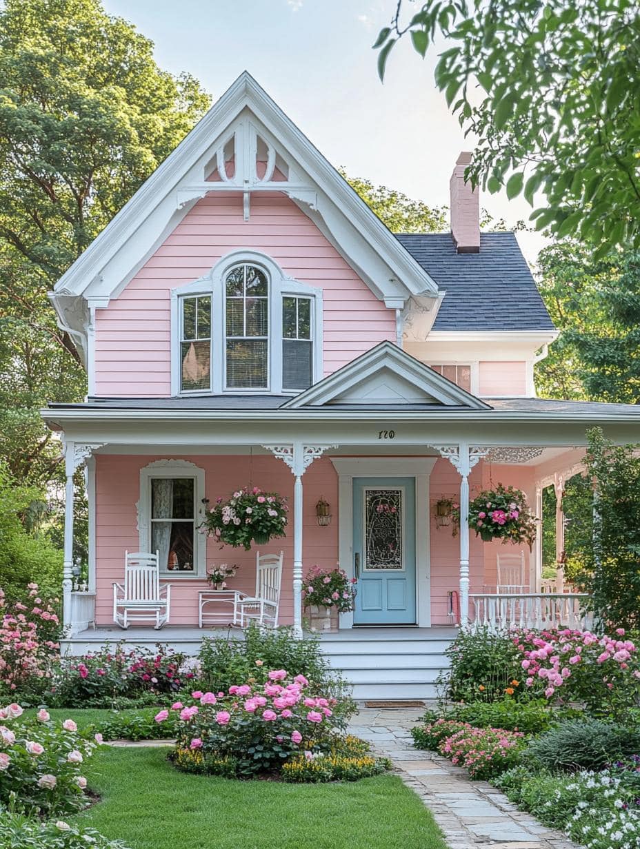
11. Dusty Rose
Dusty rose is a gentle and sophisticated color choice for your home’s exterior. It brings a warm and inviting vibe that works well with various architectural styles. This shade fits beautifully into both classic and contemporary settings.
Pairing dusty rose with other soft hues like mint green can enhance the charm of your home. Such combinations create a cozy and welcoming look, perfect for a cottage or bungalow style home.
In addition to mint green, colors like creamy off-whites or soft greys can complement dusty rose. These pairings help highlight the elegance and versatility of this color. Dusty rose is a timeless choice, giving your home an attractive and harmonious look.
12. Icy Mint
Choosing Icy Mint for your home’s exterior can give it a fresh, lively feel. This soft pastel shade brings a touch of nature, reminding you of cool breezes and gentle waves. It’s perfect for creating a serene, inviting entrance.
Icy Mint pairs beautifully with white for eye-catching contrast. You can use white for the trim and window accents to achieve a clean, polished look. This combination highlights the pastel’s brightness, making your home stand out.
For an extra touch of charm, consider adding subtle touches of gray or light beige. These colors can balance out the mint, giving your home a sophisticated edge. With Icy Mint, your house can look refreshing and bright, reflecting a cheerful and welcoming vibe.
13. Creamy Coral
When you think of a color that blends warmth and softness, creamy coral might come to mind. It’s a shade that radiates a subtle charm, bringing a sense of freshness to your home exterior. This lovely hue can make your house stand out gently, without overwhelming the other design elements.
Choosing creamy coral for your home can give it a welcoming appearance. Pairing it with neutral trims and accents, like light grays or beiges, can enhance its elegant look. This combination can create a balanced and inviting atmosphere that appeals to many.
Creamy coral works well in various lighting. Whether in bright sunlight or softer evening light, this color maintains its cheerful character. It’s perfect for people who want a warm and inviting exterior that remains friendly throughout the day.
14. Powder Gray
Powder gray is a soft, gentle shade that adds a touch of elegance to your home’s exterior. Its subtle tone is perfect for creating a calm and inviting atmosphere. Whether you have a modern or traditional style house, powder gray can enhance its charm.
You can pair powder gray with other pastels like soft pink or blue for a dreamy effect. These colors work well together and can make your home stand out without being too bold.
For a classic look, consider using white accents, like trim or shutters, to complement the powder gray. This combination is timeless and adds a clean, fresh feel to your exterior.
15. Mellow Mauve
Mellow Mauve is a gentle color that brings a sense of calm to your home. This soft pastel shade blends pink and purple, giving it a unique look that stands out without being too bold.
Mellow Mauve pairs well with whites or light grays. These combinations can enhance the charm of your house and create a welcoming feel.
Using Mellow Mauve on your home’s exterior can be a great choice if you want a touch of elegance without overpowering your space. It works well for cottages, farmhouses, and even modern homes, adding a touch of warmth and style.
16. Baby Blue Eyes
Baby blue is a soft and appealing choice for your home’s exterior. This pastel shade brings a bright and airy feel, perfect for creating a welcoming atmosphere.
When you pair baby blue with white trim, it highlights the clean lines of your home, making it look fresh and inviting. It fits well with both classic and modern architecture.
Baby blue also complements natural surroundings like trees and gardens, allowing your home to blend in with its environment. Whether you’re in the city or the suburbs, this color adds charm and peace to any home exterior.
17. Pistachio Mist
Pistachio Mist brings a soft and refreshing touch to your home’s exterior. This gentle green hue feels both modern and welcoming.
Imagine your house with the soothing vibes that Pistachio Mist offers. It works well with both traditional and contemporary styles. When paired with white trim, this color creates a fresh and clean look.
Pistachio Mist is a great choice if you love gentle, nature-inspired colors. It stands out without shouting for attention. Your home will look unique and inviting, making it a lovely place to return to every day.
18. Cloudy Slate
Cloudy slate is a soft and soothing pastel color that can enhance your home’s exterior. It combines shades of gray and blue, providing a calm and elegant look.
When you choose cloudy slate for your home, it pairs beautifully with white trim and darker accents. It adds a touch of sophistication without overwhelming the eye.
In a neighborhood, your home can stand out with its unique yet subtle charm. Embrace this color for a peaceful and welcoming appearance.
Understanding Soft Pastel Colors
Soft pastel colors bring a touch of elegance and warmth to home exteriors. These colors have unique characteristics that make them ideal for creating inviting and harmonious spaces. You will find practical benefits when choosing these hues for your home’s outside look.
What Are Soft Pastel Colors?
Soft pastel colors are gentle and muted hues, often lighter versions of primary and secondary colors. These shades include pastel pink and baby blue. They are achieved by mixing a base color with white to achieve a softer tone. The result is a color that feels inviting and light, promoting a calming atmosphere. Soft pastels often suggest a springtime or vintage feel, making them perfect for homes seeking a welcoming and unique style.
They offer varieties like mint green, lavender, and pale yellow, each bringing a unique charm. These colors are less saturated and softer than bright colors, which helps them blend beautifully into natural surroundings without overpowering their surroundings. With their subdued nature, soft pastels can make any home friendly and warm.
Benefits of Using Soft Pastels for Exteriors
One major benefit of using soft pastels on exteriors is the ability to enhance curb appeal. These colors stand out in neighborhoods dominated by neutral tones like beige or gray, offering an inviting look that grabs attention without being too bold. Another advantage is the calming effect they provide. Homes painted in soft pastels often appear serene and peaceful, creating a welcoming vibe for guests and residents alike.
Soft pastel colors are also versatile. They can be used on the siding, trim, and even roofs, depending on your design preference. For instance, pale blue or blush pink can warm up any home, while mint green can add a refreshing touch. Using complementary colors for trims and accents can further enhance their visual appeal.
Designing a Charming Exterior
Soft pastel colors can transform your home’s exterior into a welcoming and delightful sight. By carefully choosing color combinations and integrating them with your house’s architecture, you can create an eye-catching exterior.
Choosing the Right Color Combinations
Picking the right pastel colors can set the perfect tone for your home. Consider pairing mint green with pale yellow for a fresh feel, or try blush pink with lavender for a touch of romance. Contrast is essential; lighter pastel shades often work well with more neutral tones like beige or light gray.
When choosing colors, think about the elements of your home like doors, trim, and shutters. You can use soft blues to highlight these features against a pastel background. Mixing more than two pastels might be overwhelming, so maintain balance by selecting a base color and one or two accent colors.
Incorporating Pastels with Architectural Styles
Different architectural styles can greatly benefit from pastel colors. Victorian houses, with their intricate details, look stunning when accented with pastel hues on the trim and decorative features. This highlights the craftsmanship and intricate woodwork.
For a modern style home, pastels can soften the look, giving it a warm and inviting feel. Use streamlined pastel accents on front doors or window frames to add character without overpowering the design. In a cottage-style home, pastel colors can enhance the cozy and quaint vibe—think soft whites paired with gentle mint or peach shades.
Maintenance Tips for Pastel Exteriors
Taking care of pastel exteriors keeps your home looking fresh and inviting. Regular maintenance helps preserve the soft colors and charming appeal.
Cleaning:
Gently clean the walls using mild soap and water. Avoid harsh cleaners as they can damage the paint.
Check for Fading:
The sun can cause pastel colors to fade over time. Check areas that get a lot of sunlight more often.
Touch-Ups:
Keep some extra paint handy for quick touch-ups. Fix chips and cracks as soon as you notice them to prevent further damage.
Seasonal Inspections:
Inspect your home’s exterior each season. Look for any signs of peeling or wear, especially after harsh weather.
Protective Coatings:
Consider applying a protective coating to shield the paint from weather elements. This can extend the lifespan of the pastel hues.
Mind the Trim:
Keep trim and other details in good shape. Well-maintained accents highlight the beauty of pastel colors.