Choosing the right shades to pair with wood finishes can transform your space into a cozy and stylish environment. Wood’s natural beauty often shines best when complemented with colors that enhance its unique grains and tones. The perfect shades can make your wooden furniture and floors stand out, creating a warm and inviting atmosphere in your home.
While there are many options out there, finding colors that naturally suit different wood hues can be quite rewarding. From soft neutrals to warm tones, having a good color palette ensures that your decor feels harmonious and appealing.
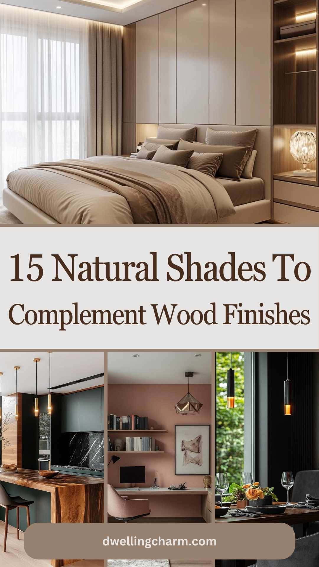
1. Soft Beige
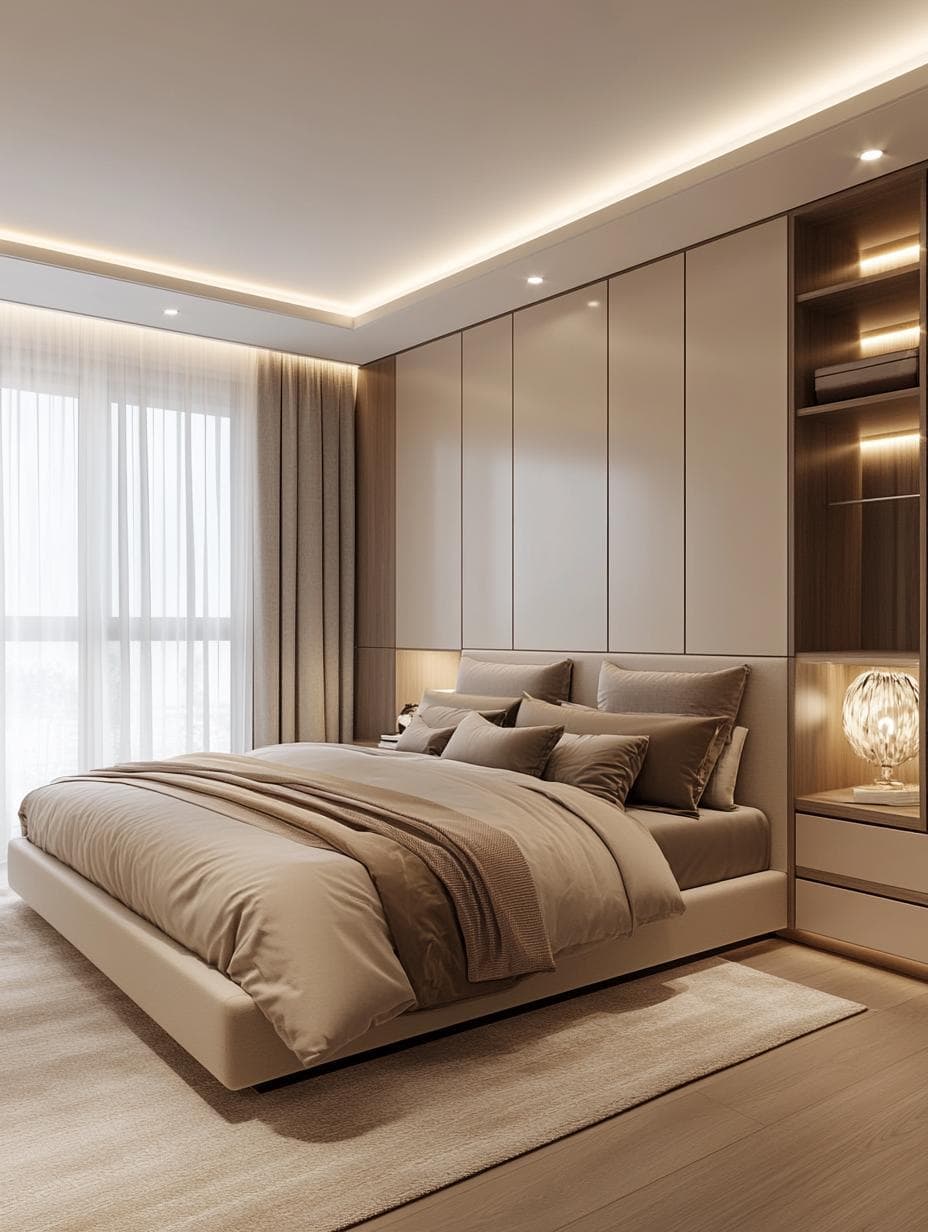
Soft beige is a gentle and warm color that pairs beautifully with wood finishes. It helps create a cozy and inviting atmosphere in your space. The subtle tones of beige complement both light and dark wood, adding a calming balance to the room.
Using soft beige on walls or furnishings enhances the natural beauty of the wood. This shade can make the textures and grains of your wooden pieces stand out even more.
It’s a versatile choice, allowing you to mix and match with other colors or décor elements. You can also use soft beige as a backdrop for colorful artwork or bright furnishings to create a lively contrast.
2. Sage Green

Sage green is a wonderful choice for adding a touch of nature to your home. It offers a refreshing and calming vibe that goes well with wood finishes. This earthy hue works beautifully in many places, such as bedrooms and living rooms.
Pairing sage green with wooden furniture creates a warm and inviting space. The gentle tone of sage green allows it to blend seamlessly with both light and dark woods. Adding decorative elements like bamboo shades or wooden shelves can enhance this natural theme.
You can use sage green on walls, as an accent color, or in various wall treatments like wainscoting. Its versatility makes it easy to incorporate into your décor while still feeling unique and charming.
3. Warm Taupe
Warm taupe is a cozy and inviting color that pairs beautifully with wood finishes. It sits perfectly between brown and gray, offering a neutral backdrop that enhances the natural characteristics of wood. Whether your wood trim is light or dark, warm taupe helps balance the look.
Using warm taupe with natural wood creates a harmonious and grounded atmosphere. This shade can blend well with other earth tones, making it easy to incorporate into different design styles. The subtle warmth of taupe complements the richness of wooden textures without overpowering them.
Consider using warm taupe on your walls to create a cozy setting in living rooms or bedrooms. It will bring out the best in your wooden furniture and accents, offering a timeless and elegant feel to your space.
4. Dusty Rose
Dusty rose is a soft, muted color that adds warmth to any room with wood finishes. Its warm tones blend nicely with both light and dark woods, giving a cozy, welcoming feel. If you’re looking to create a calm and relaxing space, dusty rose could be the perfect choice.
Adding dusty rose to a room with natural wood trim enhances the beauty of both elements. This color pairs well with various wood shades, making it versatile for different design styles. Plus, it brings a touch of elegance and softness to your decor.
For a balanced look, try combining dusty rose with neutral accents like white or gray. This combination highlights the natural beauty of your wood finishes while maintaining a sophisticated atmosphere. Dusty rose can be used in wall paint, throw pillows, or even artwork to create a cohesive design.
5. Charcoal Gray
Charcoal gray is a versatile color that complements wood finishes beautifully. This shade helps to balance and deepen the natural tones of wood.
When paired with light wood finishes, charcoal gray adds contrast and a modern touch to the room. It works well in spaces where you want to keep the focus on the wood’s natural beauty.
In combination with darker wood, charcoal gray offers a soft, calming effect. It helps create a serene atmosphere that feels warm and inviting. This pairing is perfect for creating a cozy, stylish space that still highlights the wood’s richness.
6. Ivory Cream
Ivory Cream is a warm, soft color that goes beautifully with wood finishes. It has a gentle, inviting vibe. Pairing it with natural wood can add a touch of elegance to your space.
This shade works well in many rooms, including living areas and bedrooms. The creamy tone highlights the wood’s natural beauty, creating a cozy and harmonious atmosphere.
Consider using Ivory Cream on walls, and complement it with wood furniture or trim. This combination keeps the space feeling balanced and welcoming.
7. Muted Gold
Muted gold is a lovely choice to pair with wood finishes. This color adds warmth without being too flashy. It complements the natural tones found in wood, enhancing its beauty.
In a room with natural wood trim or furniture, muted gold can create a cozy and inviting atmosphere. It’s a versatile shade that matches well with both light and dark woods.
Muted gold also works well with various decorating styles. Whether you enjoy a rustic look or a more modern vibe, this color can seamlessly fit into your design.
8. Forest Green
Forest green is a beautiful color to pair with wood finishes. Its deep, natural hue brings a calming and earthy vibe to any room. You can use this color in places like the living room or bedroom to enhance the warmth of wooden elements.
Try mixing forest green with lighter colors like soft pink or white. This can create a balanced and inviting look. The fresh vibe of the greens will help highlight the warm undertones in the wood.
Forest green also works well in spaces with lots of natural light. The green will capture the sunlight and create a cozy atmosphere. Add this shade through accents such as pillows, curtains, or wall paint to bring life to your wooden interiors.
9. Ocean Blue
Ocean Blue is a soothing and versatile color that pairs beautifully with wood finishes. It brings a relaxed vibe to any room, reminding you of calm seas and clear skies.
In a kitchen, Ocean Blue cabinets work well with light wood trims. This combination creates a stylish and coastal feel. Adding white or cream accents can enhance the airy atmosphere.
Consider using Ocean Blue in living spaces with wooden furniture. It can highlight the natural tones of the wood and add a touch of tranquility. Whether on walls or as part of decor, this color promotes a peaceful environment.
10. Brick Red
Brick red is a warm, inviting color that works beautifully with wood finishes. When you pair it with natural wood, it adds a cozy feel to any room.
Try using brick red on walls or accents. It stands out nicely against lighter wood tones, like pine or oak, without overwhelming the space. This color also complements deeper wood shades, giving a rich, earthy vibe.
Consider using brick red in living rooms or dining areas where you want to create a welcoming atmosphere. It helps highlight the character of wood furniture and gives a bold touch to the overall look.
11. Slate Blue
Slate blue adds a touch of calm elegance to any room. It’s a balanced shade that sits between blue and gray, making it versatile enough to use almost anywhere. This color pairs beautifully with natural wood finishes, enhancing the richness and texture of the wood.
You can use slate blue to create a sophisticated look. It blends well with warm neutrals like beige and taupe, adding a sense of relaxation. This color works well in living rooms or bedrooms, where you want a soothing atmosphere.
For a more vibrant look, consider accents in muted shades of yellow or orange. These colors can brighten the overall palette without overwhelming the space. Slate blue is adaptable, allowing you to experiment with different styles and vibes in your home.
12. Olive Green
Olive green is a versatile and enduring color that brings an earthy feel to your home. It works beautifully with various wood finishes, enhancing the natural beauty of the wood.
Pair olive green with brown shades. This combination creates a warm and inviting atmosphere, perfect for cozy living spaces.
You can also add texture and depth by mixing in natural materials like leather. Incorporating leather furniture or accents adds sophistication to any room.
Olive green’s muted tones provide a calming backdrop. It’s an excellent choice for spaces where you want to relax and unwind.
Consider using olive green in bedrooms or living areas. It pairs well with blush pink for a softer touch or with cool gray to highlight the wood’s richness.
13. Pale Lavender
Pale lavender brings a soft and calming vibe to any space. It’s a great choice if you’re looking to highlight natural wood finishes.
Pairing pale lavender with wood tones adds a touch of elegance without being too bold. The gentle color doesn’t overpower, creating a perfect balance.
When you use pale lavender textiles, like pillows or rugs, alongside wooden furniture, the mix of materials feels cozy and inviting. This combination works well in both modern and traditional settings, so you can easily incorporate it into your home.
Whether it’s through wall paint or small decorative items, pale lavender can uplift your decor with a fresh and lovely touch.
14. Terracotta Orange
Terracotta orange is a warm, earthy color that pairs beautifully with wood finishes. It adds a cozy and natural vibe to any space. When you use terracotta alongside wood, it can create a harmonious and inviting atmosphere.
This shade works well with both light and dark wood tones, highlighting their natural beauty. You can use terracotta in paint, furnishings, or decorative accents to achieve a balanced look.
Consider complementing terracotta orange with natural textiles like cotton or linen. This combination can enhance the warmth of the wood and create a welcoming, homely feel.
15. Navy Blue
Navy blue is a versatile color that pairs naturally with wood finishes. Its deep hue can create a striking contrast with lighter woods like oak or pine, adding depth and drama to a room.
When combined with darker woods, navy blue brings a touch of elegance and sophistication. This color scheme is often found in stylish interiors and offers a classic look.
You can use navy blue in furniture, accent walls, or decorative items. It works well with textures like leather or velvet, adding a plush feel to your space. Consider adding navy blue throw pillows or a rug to highlight wood floors.
Navy blue is also calming, which makes it a great choice for bedrooms or living areas. It’s a color that blends well with natural elements, making your spaces feel cozy and balanced.
Understanding Natural Tones
Exploring natural tones can enhance the beauty of wood finishes in your home. These shades include soft earth colors and muted hues that pair well with various wood types, bringing balance and warmth to any space.
What Are Natural Shades?
Natural shades are colors found in nature. Think of soft greens, gentle browns, light grays, and soft whites. They resemble the hues you see in natural settings like forests, beaches, and mountains.
These shades work well because they blend seamlessly with the organic textures of wood. When you use natural tones, you aim to echo the soothing qualities of the outdoors, creating a calming environment inside your home. This makes them a smart choice for spaces where you want to relax and feel grounded.
Using a mix of natural shades can also add depth and variety to your decor. This allows for a flexible design palette that doesn’t feel overwhelming. By keeping these colors subtle, you enhance the natural beauty of the wood without overpowering it.
How Natural Tones Enhance Wood Finishes
Natural tones have a unique way of highlighting the features of wood. They enhance grain patterns and subtle variations in color, drawing attention to these details. When you use these colors, the different wood finishes complement one another, creating a sense of unity.
For example, pairing a pale green with a light oak floor can add freshness and vibrancy. Similarly, a soft gray wall can make a dark walnut table stand out more. These combinations can transform mundane spaces into inviting environments that highlight the craftsmanship of your wood pieces.
By connecting the wood’s natural patterns and undertones, you create a cohesive look. This approach can beautifully tie together different elements in a room, enhancing the entire space.
Choosing the Right Shade for Your Wood Finish
Picking the right shade to go with your wood finish can change the way a room looks and feels. It’s important to think about how different factors, like the kind of wood and the lighting in the room, will affect how colors appear.
Factors to Consider
When selecting a shade for your wood finish, consider the existing color scheme of your room. Think about the walls, furniture, and even smaller accents. The colors should work together to create a welcoming atmosphere. Earth tones, such as greens and browns, often blend well with wood tones, giving the space a calm, natural vibe.
You should also take into account the type of wood. Lighter woods might be complemented by soft pastels or cool whites to emphasize their airy feel. Meanwhile, darker woods might pair beautifully with bold blues or rich burgundies, providing a striking contrast.
Impact of Lighting on Color Perception
Lighting plays a big role in how color is perceived in a room. Natural daylight tends to show a color’s true appearance, while artificial light can alter it significantly. Warm lighting can make colors look softer and cozier, whereas cool lighting may make them appear more vibrant and sharp.
Testing paint samples on your walls and observing them at different times of the day is helpful. This can help you understand how lighting affects the chosen shades. Consider the direction your windows face too; north-facing rooms receive cooler light, which can influence how colors appear.