Color plays a huge role in setting the mood and style when you think about decorating your home. Using a single color in different shades, known as a monochromatic scheme, can create a clean and cohesive look. It’s a great way to make your space feel both modern and organized.
Exploring these color schemes can help you simplify the design process by limiting choices to variations of one color. This approach not only enhances the aesthetic appeal but also makes designing less overwhelming and more fun.
1. Arctic White Delights
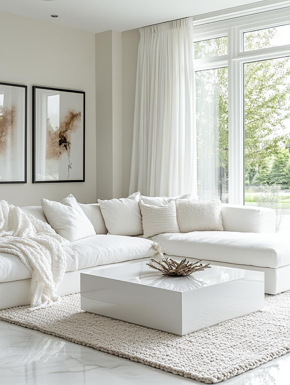
Arctic White is a favorite for modern homes. This crisp color offers elegance and versatility. It pairs well with various design styles and furniture pieces.
Use Arctic White for a clean, fresh look. It creates a bright and open space, making rooms feel larger. Don’t be afraid to mix textures with this shade.
Add depth by combining Arctic White with different finishes. You can choose matte or glossy elements. Accent with subtle colors or neutral tones for a balanced vibe in your home.
2. Slate Gray Elegance

Slate gray is a wonderful color choice for creating a calm and sophisticated vibe. Its mix of blue, gray, and green tones makes it versatile and soothing.
Utilize slate gray on your walls for a modern and elegant backdrop. Pair with light furniture to keep the space open and inviting. Slate gray also works magic on kitchen cabinets, creating a sleek and modern kitchen look.
Even small accents like cushions or rugs in slate gray can tie a room together. It matches well with natural wood for a cozy feel, or with metallic finishes for a more polished vibe. With slate gray, your home can feel both stylish and comfortable.
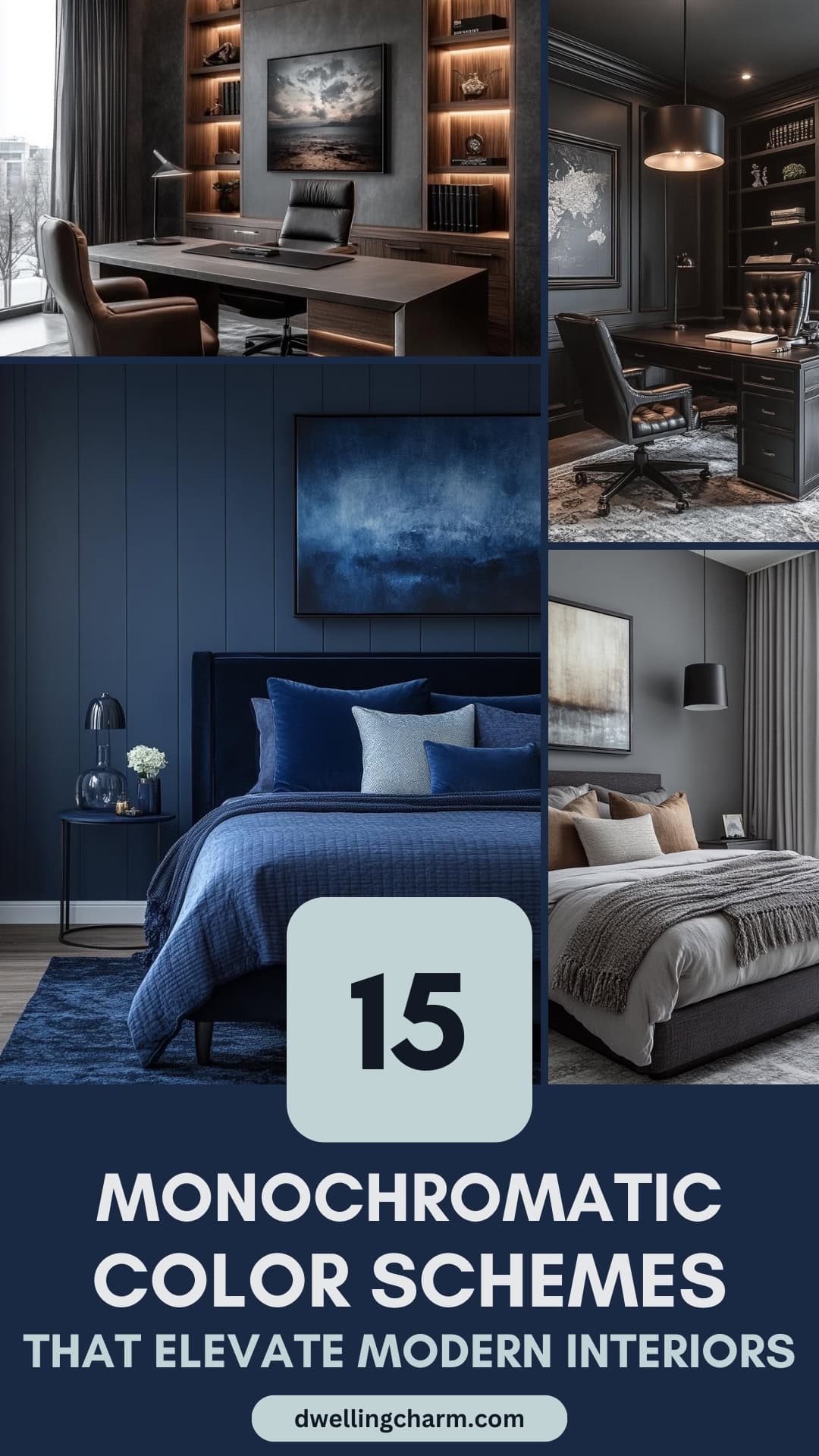
3. Indigo Depths
Indigo brings a sense of calm and depth to your space. When you use different tones of indigo, your home feels both soothing and rich.
To create a monochromatic indigo scheme, mix lighter shades with deeper tones. This combination can be bold yet balanced. It’s perfect for those who love a modern, sleek look.
Pair indigo with white accents for a fresh touch. This contrast highlights the darker tones, making them stand out. A few simple accessories in white can do wonders.
Adding textures like fabrics and rugs in various indigo hues can enhance your room’s character. Soft velvet or simple cotton, all in shades of indigo, provide a cozy and inviting atmosphere.
Indigo is versatile and fits well in any room. Whether it’s the living room, bedroom, or even a chic dining area, indigo brings elegance and style.
4. Charcoal Charm
Charcoal gray brings a modern and sleek feel to any room. Pairing it with crisp white can create a sophisticated and timeless look. This combination is perfect for achieving a balanced, clean, and contemporary style.
Experiment with textures to add interest. Consider using charcoal gray in furniture or walls, and add soft, cozy throws or cushions in lighter tones to contrast.
Using metallic accents, like silver or chrome, can accentuate the charcoal, giving your room a polished touch. You could also introduce greenery for a fresh pop of color.
This color scheme is versatile, working nicely in living rooms, kitchens, or bedrooms. It offers a neutral backdrop that lets you switch up accents easily whenever you’re in the mood for a change.
5. Warm Taupe Hug
Taupe is like a soft hug, blending elements of brown and gray. Using taupe for walls, sofas, or curtains can create a peaceful space. It works well with various textures like velvet or linen, adding depth to your room.
You can pair taupe with warm colors or use it in a monochromatic scheme for a modern look. It looks great against natural light, making spaces feel open and welcoming.
6. Ivory Dreamscape
An ivory dreamscape offers a soft, warm hug, perfect for those who love subtle elegance and timeless style. Ivory pairs beautifully with other light shades like dusty rose. You can use this combination to create a cozy and romantic vibe in your living space.
Don’t forget texture! Add some soft fabrics, like throw pillows or plush rugs, to make the room even more inviting. Small details, like gold or silver accents, can also add a touch of glam without overwhelming the space.
7. Serene Blue Mist
A serene blue mist brings a sense of calm and relaxation to your modern home. This soft blue hue is perfect for creating a peaceful atmosphere. It works well in spaces with plenty of natural light, as it balances warmth and coolness beautifully.
Incorporate this shade into your walls to establish a soothing base. Pair it with light furniture for a cohesive look. Decor accents, like cushions and throws in varying shades of blue, enhance the monochromatic theme.
Consider using natural materials like wood and stone to add texture and interest. These elements complement the blue tones, creating a harmonious environment. Use soft lighting to maintain the tranquil vibe and make your space inviting.
8. Graphite Boldness
Graphite is a fantastic way to add a touch of boldness to your home. This deep, dark gray can create a striking appearance when used as the main color in a room. It has a sleek, modern vibe that works well in stylish living rooms or chic bedrooms.
You can use graphite in a variety of ways to make a statement. Paint an accent wall or choose graphite-colored furniture and accessories. These choices allow you to layer different shades of gray for a monochromatic look that feels cohesive.
Pairing graphite with materials like metal, glass, or wood adds more depth and interest to your space. These textures can complement the color, bringing out its bold and stylish nature.
9. Soft Linen Whisper
Soft Linen Whisper is a monochromatic scheme that revolves around airy, muted tones that create a serene and inviting atmosphere. This gentle palette is perfect if you love a soothing environment without overwhelming colors.
Your space can become a haven of relaxation with shades of light cream, delicate beige, and subtle off-white. These colors work harmoniously to enhance natural light and give your rooms a spacious, open feel.
You can add texture with linen curtains, plush rugs, or soft throws. The beauty of Soft Linen Whisper is in its timeless elegance, making it easy to incorporate into any room in your home. It wraps you in calm, offering a simple yet refined aesthetic that never goes out of style.
10. Sun-kissed Sand
A sun-kissed sand color scheme brings a gentle, inviting feel to your space. This palette highlights various shades of beige and soft gold, mimicking the look of sunlit dunes.
Pairing these tones with natural textures like jute or wicker can enhance the coastal vibe. Introduce elements such as sandy-colored cushions or pastel gold curtains. These additions breathe life into your room without overwhelming the senses.
For a bit of contrast, consider dark wood accents or white trim. These can help highlight the warm hues and make the space feel balanced. A sun-kissed sand theme is easy to match with your existing decor and creates a calming, modern look.
11. Dove Grey Calm
Dove grey is a wonderful choice if you’re looking to add a calm and modern feel to your home. This color has a soft, soothing quality that can make a space feel peaceful. It’s both stylish and timeless, fitting perfectly into any contemporary setting.
You can easily pair dove grey with other colors. It blends well with warm shades like terracotta or mustard yellow to create subtle contrasts. This flexibility allows you to play with different styles and moods in your home.
Using dove grey on your walls sets a serene backdrop. You can introduce textures and fabrics in similar tones to enhance the cozy atmosphere. This color not only uplifts a room but also makes it feel inviting and balanced. It’s a go-to choice for anyone wanting to embrace simplicity and elegance.
12. Sage Shadow
Sage Shadow is a tranquil color that brings a touch of nature into your home. This soft shade of green is infused with hints of gray and blue, creating a calming effect. It pairs beautifully with natural wood and white tones, enhancing the modern aesthetic.
You can use Sage Shadow in spaces where you want to relax and unwind. Living rooms or bedrooms are ideal for this soothing color. Try painting an accent wall or adding Sage Shadow accessories like pillows or throws.
Combine Sage Shadow with other soft shades like cream or taupe for a harmonious look. This creates an inviting and cozy atmosphere. With its understated elegance, Sage Shadow is perfect for any modern home wanting a touch of nature.
13. Midnight Reflection
Midnight Reflection is all about using dark shades to create a peaceful and calming space in your home. You might think dark colors would make a room feel smaller, but they can actually add depth.
When you use Midnight Reflection in a living room or bedroom, try adding texture with soft throws and velvet pillows. Adding some metallic or glass accents can reflect light and give a touch of brightness.
Consider painting the walls a deep navy or charcoal. This is perfect for spaces where you want to relax and unwind, like a home office or reading nook.
14. Silver Lining Splash
Imagine adding a touch of elegance to your home with a silver lining splash. This idea can brighten rooms and make them feel light and airy. Silver blends well with other colors, adding a chic and modern look.
Use silver in subtle ways, like with shiny steel backsplashes in kitchens. You could also choose silver in furniture or decor items. Even small touches can catch the light beautifully, making spaces more dynamic.
White and silver work together beautifully. Think about white curtains that gently frame your windows, letting light bounce off metallic accessories. This combination can lift the atmosphere, creating a fresh vibe.
15. Alabaster Haven
Imagine a bright, calming space in your home—this is what an alabaster color scheme can offer. Alabaster, a soft, creamy white, brings warmth and serenity. It’s perfect for creating a modern monochromatic look that still feels cozy.
Incorporate alabaster in your walls, furniture, and decor. The subtle undertones of yellow or greige add depth without overwhelming. It balances well with natural light, making rooms feel open and inviting.
Pair alabaster with different textures like soft textiles or stone accents to prevent the space from feeling too flat. This variation keeps the room interesting. Alabaster is versatile, fitting different styles from minimalistic to traditional, always bringing a touch of elegance.
Understanding Monochromatic Color Schemes
Monochromatic color schemes use one base hue, with variations in tone, shade, and tint adding depth and interest. Besides their simplicity in design, these schemes can create specific moods, enhancing the emotional atmosphere of a space.
What Makes a Scheme Monochromatic?
A monochromatic color scheme relies on a single hue as its foundation. From this base color, you create variations using tones (achieved by adding gray), shades (darkened with black), and tints (lightened with white).
This approach is great for creating harmony because all the variations come from one main color. For instance, a palette centered on blue might include royal blue, navy, and sky blue. This cohesion forms a balanced look, making design choices easier and cohesive.
Monochromatic schemes are versatile. They can be either soft and subtle or bold and striking, depending on the base color you choose. It’s a flexible approach that can be tailored to suit different styles and preferences.
The Psychological Impact of Monochromatic Colors
Different colors evoke different feelings. Using a monochromatic scheme, you can influence the mood of a space. For example, multiple shades of green can make a room feel refreshing and lively.
Blue variations often bring about a calm, peaceful vibe, while reds might add warmth and energy to an area. It’s essential to choose the base hue in line with the atmosphere you want to achieve.
By focusing on one color, this approach simplifies design and enhances emotional impact. It also allows you to emphasize textures and shapes in the room, creating a more engaging environment.
Implementing Monochromatic Designs in Modern Homes
Monochromatic designs can transform a space by using variations of a single color. With the right choices, you can achieve a cohesive and stylish look. Key elements include selecting an ideal base color and playing with different textures and patterns to add depth.
Choosing the Right Base Color
The base color is the most important part of creating a monochromatic scheme. Start by thinking about the mood you want to set. For a calm space, blues or greens work great. If you prefer energy, go for yellows or reds.
Consider the room’s purpose and lighting. Natural light can affect how a color looks. A sunlit room might wash out pale colors, while dim rooms could benefit from light, vibrant hues. Keep these in mind when deciding, as they influence your color choice.
Don’t forget about furniture and accents. These should match the shades of the base color. Using a color wheel can help you find tints and shades without straying from your primary hue. This not only ensures a balanced look, but also makes the space feel intentional and cozy.
Balancing Textures and Patterns
Textures and patterns bring a monochromatic room to life by creating contrast. Consider mixing materials like wood, metal, and textile to bring variety to the space. A velvet sofa paired with wooden accents can create a rich, inviting setting.
Patterns add another layer to your design. You might use stripes, polka dots, or abstract designs in the same color family. Use them sparingly, focusing on pillows, rugs, or curtains to prevent overwhelming the space.
Texture and pattern combinations add depth but remember to keep them within the same color palette. This approach maintains harmony while allowing individual elements to stand out. By balancing these elements, you can achieve an engaging look that remains true to your monochrome theme.
Common Mistakes to Avoid
Creating a harmonious monochromatic color scheme can be tricky. It’s important to balance shades and consider how light affects color to avoid common pitfalls.
Overusing a Single Hue
Relying too heavily on one shade can make a room feel flat and boring. If everything is the same exact color, it might not stand out as you hoped. The solution is to mix different tones, tints, and shades of the chosen color. For example, if your base color is blue, try using light blues and dark blues together.
Textures can also play a crucial role. Consider glossy or matte finishes to break up the monotony. This can help each element in a room to feel unique, while still sticking to your color theme. Additionally, adding patterns can provide visual interest; think about striped or polka-dotted textiles.
Ignoring Lighting Effects
Lighting is a game-changer when it comes to color perception. How your chosen color looks in natural daylight might be completely different under artificial lighting. In a monochromatic scheme, this can make some areas appear unexpectedly dull or too intense.
Pay attention to how light plays across the space throughout the day.
Use a mix of lighting sources. Floor lamps and pendant lights can complement your main color and add warmth. Use light bulbs in different warm or cool tones to see how your color reacts.
Good lighting planning ensures your chosen color shines beautifully at any hour.