Spring is here, and it’s the perfect time to refresh your home with new paint colors. As the days grow longer and the flowers bloom, bringing vibrant and fresh hues into your living space can make everything feel lighter and more inviting. Discovering the right paint colors can help create a warm and welcoming atmosphere, lifting your spirits each time you walk through your doors.

From soft pastels to bright citrus shades, the choices for spring-inspired colors are endless. Whether you’re considering a full room makeover or just a simple accent wall, choosing the right palette can transform your home. Let the energy of the season guide you toward creating spaces that not only look beautiful but also reflect the joy and renewal that spring brings.
1. Sunlit Coral
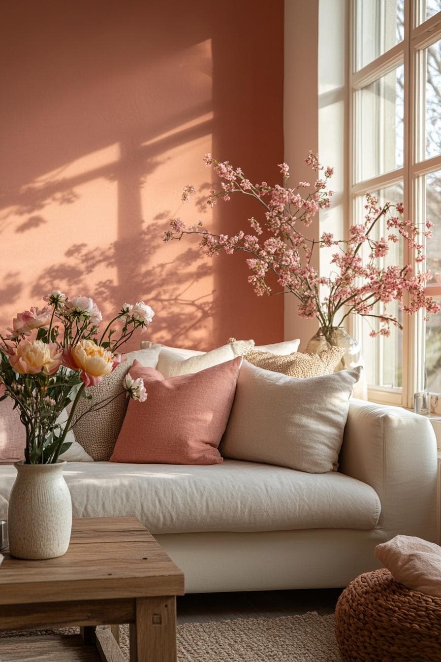
Sunlit Coral is a beautiful and vibrant color that can bring a fresh, spring vibe to any room. It’s a soft pastel shade with notes of pink and orange, creating a warm and inviting atmosphere. When you use this color, you can almost feel the cheerful energy it brings to a space.
This color works well in many different rooms, from bedrooms to living rooms. You can pair it with neutral tones or bolder colors to create a stunning look. Sunlit Coral is a versatile choice that can brighten your home with a touch of elegance and charm.
2. Breezy Blue

Breezy Blue is a refreshing color choice that perfectly captures the spirit of spring. It’s a gentle hue that brings a calming and airy feel to any room. This shade creates a light and welcoming atmosphere, making it a great option for living rooms or bedrooms.
You can pair Breezy Blue with whites or soft grays to enhance its peaceful vibe. The color works beautifully on walls and can be complemented with decorative elements like pillows or rugs in similar tones. If you want to add a splash of color without overwhelming the space, Breezy Blue is an ideal choice.
3. Spring Meadow Green
Spring Meadow Green is a soothing color that instantly brings the essence of nature into your home. This lovely shade of green has a balanced, fresh vibe perfect for living spaces or bedrooms. It creates a peaceful atmosphere and a sense of renewal, making it ideal for spring.
You can pair Spring Meadow Green with soft whites or neutral shades for a harmonious look. It goes well with natural wood tones, enhancing its earthy charm. A touch of this color can make any room feel more open and inviting.
4. Peach Blossom
Peach Blossom brings a fresh and cheerful vibe to your home. With its soft, warm tones, this color brightens any space. It reminds you of spring blooms and sunny days.
Pair Peach Blossom with whites or creams for a clean, light look. This combination keeps things simple and inviting. You can also add splashes of greenery for a natural touch.
Using Peach Blossom in your living room or bedroom creates a cozy yet lively atmosphere. Its versatility works well with different styles, from modern to rustic. Embrace the warmth and brightness of Peach Blossom for a pleasant and inviting home environment.
5. Gardenia White
Gardenia White is a bright and inviting color choice for a fresh spring look. With its soft pink undertones, it offers a warm and cozy vibe. This shade not only brightens up any space but also pairs beautifully with other colors.
When selecting complementary shades, consider options like a deep gray or a soft beige. These will enhance the elegant simplicity that Gardenia White brings. For a dash of calm, pair it with a subtle blue or green.
Perfect for any room, Gardenia White works well in living areas or kitchens. The light-reflecting quality ensures rooms feel open and airy. Embracing this shade can bring a refreshing change to your home, making it feel like spring all year round.
6. Lilac Whisper
Lilac Whisper is a soft, calming shade of purple that can bring a touch of serenity to your space. This gentle hue works beautifully in bedrooms or living rooms where you want to create a relaxing atmosphere.
Pair it with whites or light grays for a clean, airy look. Adding some green plants or natural wood accents can enhance the calming effect.
This color is perfect for bringing a fresh, spring vibe into your home all year round. With its subtle yet charming presence, Lilac Whisper is a great choice for brightening up any room.
7. Mint Frost
Mint Frost is a refreshing paint color that can brighten up any room. It has a soft green hue mixed with a bit of blue. This gives it a cool and calming feel, perfect for creating a peaceful atmosphere.
When you use Mint Frost in your home, it can remind you of a gentle spring breeze. It’s an inviting color that works well in many spaces, like living rooms, bedrooms, and even bathrooms.
Pair Mint Frost with white or light gray accents to keep things light and airy. You can also use it with natural wood tones for a cozy and welcoming vibe. Give your home a fresh, spring feel with the lovely shade of Mint Frost.
8. Blossom Pink
Blossom Pink is a color that brings softness and warmth to your space. It’s a gentle, light pink that feels fresh and cheerful. This shade perfectly captures the essence of new spring blooms.
With Blossom Pink, you can create a welcoming atmosphere in any room. It pairs beautifully with white or natural wood accents, making it an ideal choice for bedrooms or living rooms. This color can add a touch of elegance without feeling overwhelming.
Use Blossom Pink on walls or smaller decor items, like pillows and throws, to give your home a new spring vibe. It’s a versatile option for those who love a subtle yet charming touch of color.
9. Buttercup Yellow
Buttercup Yellow captures the cheerful vibe of spring. It has the warm, sunny feel of a bright day. This color fills a room with happiness and energy, making it perfect for spaces where you want a lively atmosphere. Whether in your kitchen or living room, it adds a lively touch.
This hue pairs well with natural elements like wood and plants. It creates a balanced look, making your home feel fresh and inviting. Adding Buttercup Yellow to an accent wall or through decor pieces can uplift your space without being too overwhelming.
10. Skyline Gray
Skyline Gray is a wonderful choice for refreshing any space. It sits in the gray color family and offers a soft, neutral backdrop. This paint can help create a calming atmosphere in your home.
With its balanced tone, Skyline Gray brings warmth and serenity. It’s ideal for both modern and classic interiors. You can pair it with whites or blues for a perfect match.
Try Skyline Gray in a living room or bedroom to enhance the peaceful vibe. Its versatility makes it suitable for any room where you want to invite relaxation and comfort.
Understanding Spring Color Trends
Spring brings vibrant changes, and colors play a big role. Spring paint trends often reflect this fresh and lively energy, focusing on colors that inspire joy and renewal.
The Psychology of Color in Spring
Spring colors often include pastel hues and bright shades. These colors are known to improve mood and bring a sense of freshness. Warm tones like soft yellows and pinks create a cozy atmosphere, inviting happiness and cheer.
Bold colors like rich reds or deep blues can add drama and sophistication. They are great for making a statement in living rooms or kitchens. Neutral tones like light grays and beiges can be both soothing and rejuvenating, making them perfect for any room.
Each color has its own way of affecting emotions. Understanding these effects helps you choose colors that create the right mood in your spaces. Consider how different shades interact with light at different times of the day. This can help you decide what color works best in different rooms.
Inspiration from Nature
Nature is a huge source of inspiration for spring color trends. This season, soft greens and blues mimic the colors of new leaves and clear skies. These shades bring peace to your home, like stepping into a serene garden.
Warm tones like sandy beiges and earthy browns reflect the ground’s awakening and create warmth. Floral-inspired hues, such as lavender and rose, mimic blossoming flowers. These colors not only brighten up spaces but also bring a touch of nature inside.
Patterns from nature, like the textures of bark or the flow of water, can inspire paint finishes too. Using these natural ideas in your home can create spaces that feel connected to the outside world, providing a restful retreat each day.
How to Choose the Right Paint Colors
Selecting paint colors for your home is exciting yet challenging. It’s crucial to consider how the colors will fit with your room’s mood and how light will affect their appearance.
Considering Room Ambiance
Think about how you want the room to feel. Cozy spaces like bedrooms often benefit from warm, soft hues. Earth tones and muted colors can create a calming atmosphere. For lively areas such as kitchens or living rooms, brighter and more vibrant colors can add energy and interest.
Consider the function of the room. In spaces meant for relaxation, like bathrooms or reading nooks, you might opt for cool blues or greens. These colors can create a refreshing and tranquil vibe.
Tip: Test different shades on your wall before committing. Seeing how colors look at different times of day helps ensure you’ll love your choice.
Lighting and Color Perception
Natural and artificial lighting can transform paint colors. In natural daylight, a color might look rich and warm, but it can appear muted under artificial light. Rooms with lots of sunlight can handle cooler colors, as the light warms them up.
In spaces with limited natural light, consider using lighter shades to keep them from feeling too dark or closed in. If you have LED lights, remember they often cast a cooler light, which can affect how colors appear.
Assess paint samples in various lighting to gauge true color impact. Your favorite shade might change dramatically from one room to the next due to lighting differences.